Sheen Common Drive, London | A High-End Kitchen With Illuminating Details
For this project, we had the pleasure of designing a kitchen with detail at its centre. The delicate, sophisticated touches are what make this kitchen – such as the brass-effect finish within the panels of the handleless units. A beautiful contrast with the elegant chandelier and the luxurious marble worktops.
Our clients desired a kitchen that could seamlessly accommodate their family routines while also providing an enjoyable space for entertaining – something they weren’t sure was possible until we revealed the full potential of their space. By carefully considering colour, texture, and functionality, we created a design that fosters both relaxation and interaction, perfectly balancing family needs with an inviting atmosphere for guests.
Finishes:
Brass-effect finish panels
Moonrock granite worktop
Bespoke shelving
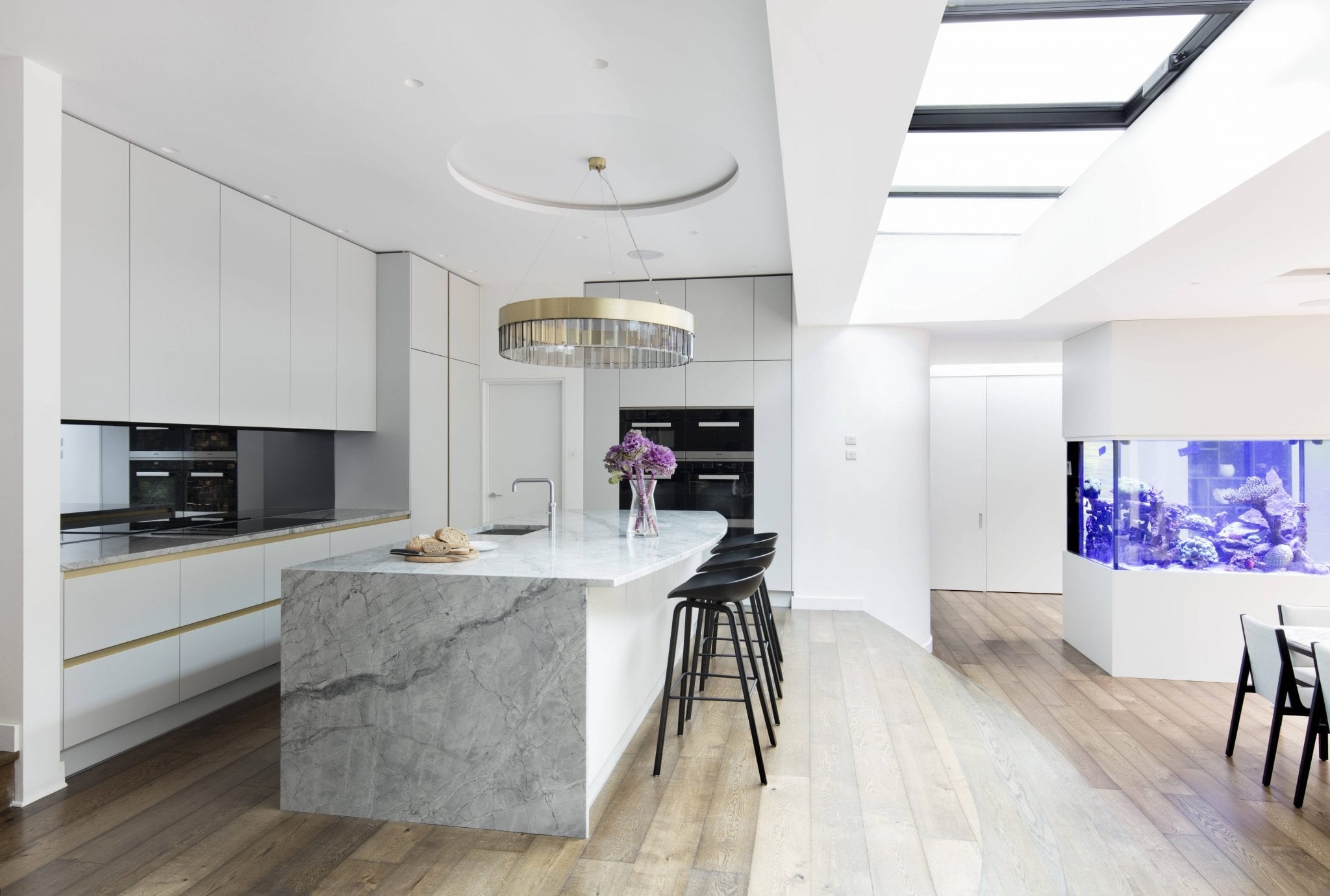
The dominant use of white within the colour palette of this kitchen opens up the space and reflects the natural lighting streaming through the skylights dramatically enhancing the appearance of space.
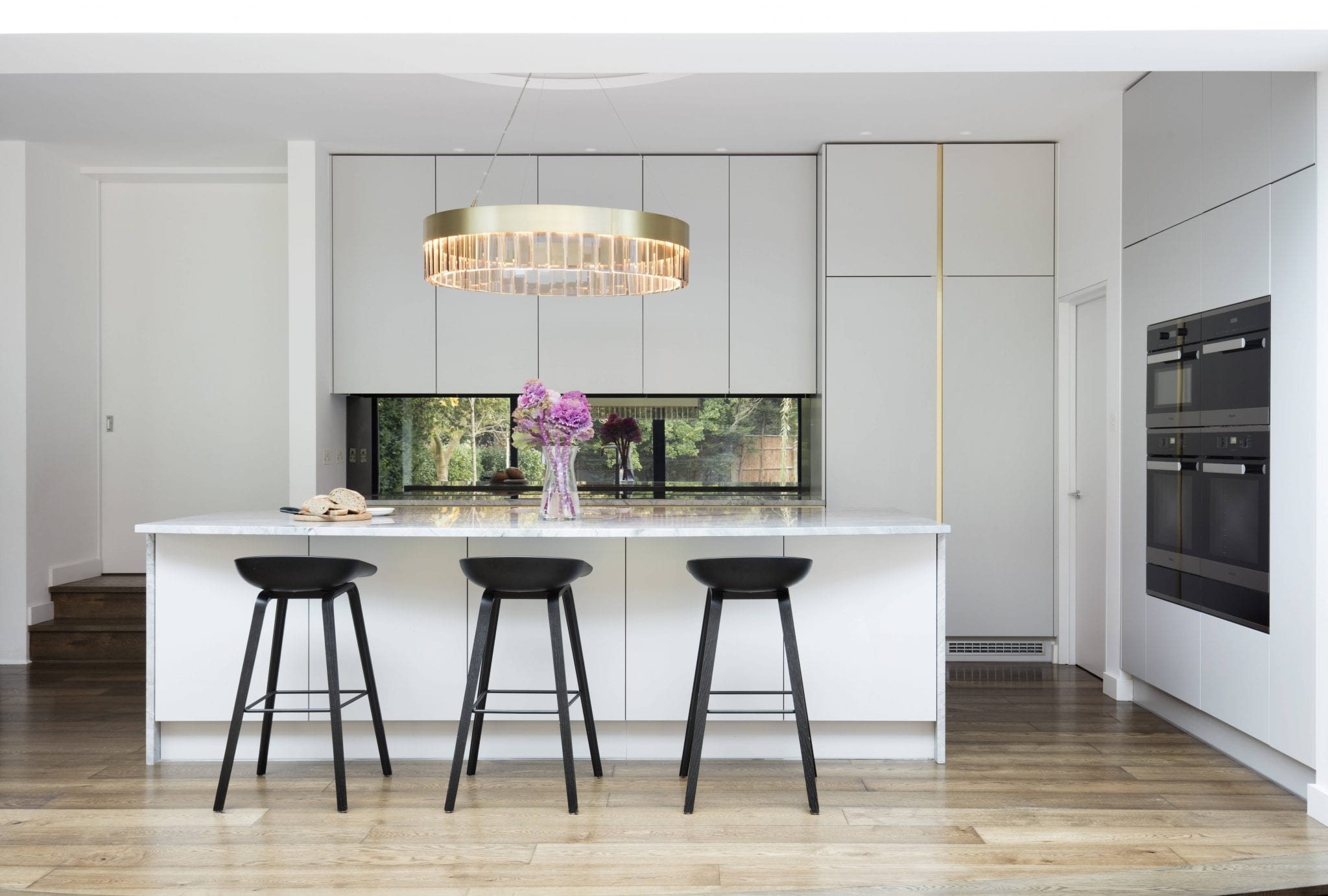
To maximise storage and maintain a clean aesthetic, additional units were designed on both sides of the island. Now, storage is always at hand and disorderly interiors are a thing of the past.
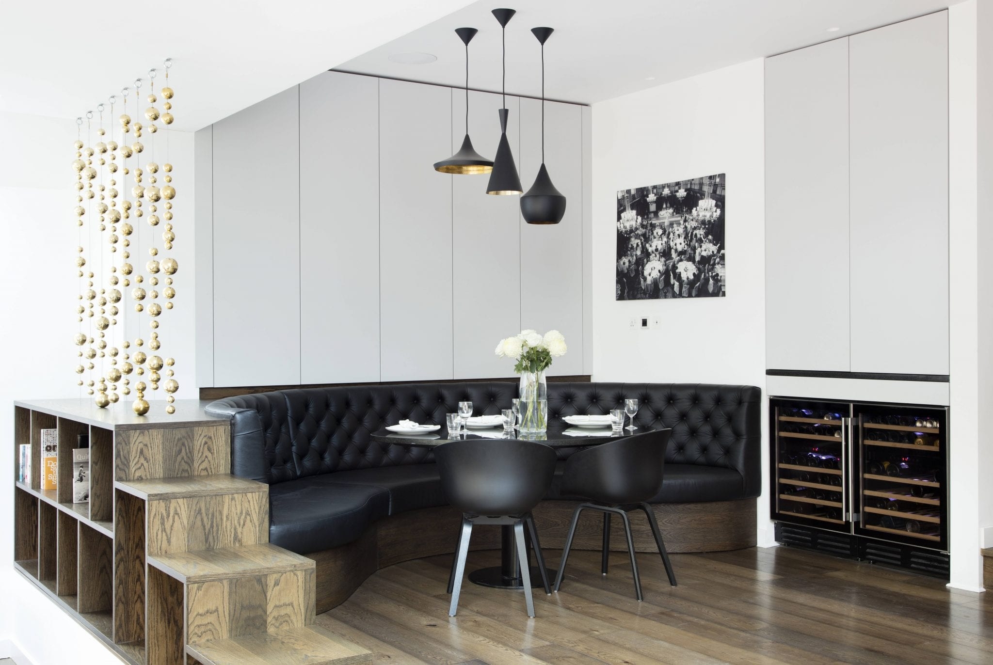
To add warmth and flexibility to the space, we crafted bespoke shelving that can be moved aside when more floor space is needed. This clever design allows the kitchen to adapt based on how the space is being used, without compromising on style.
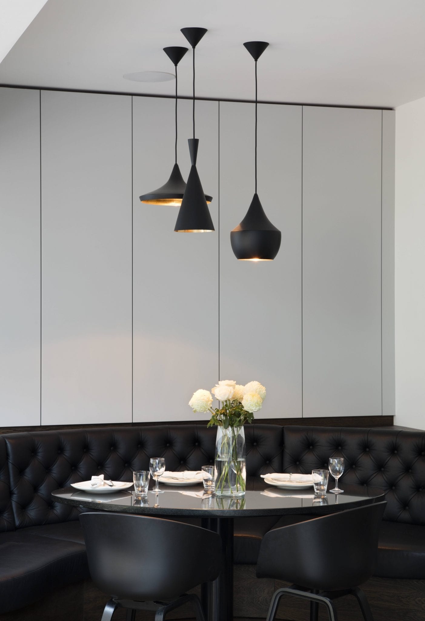
In the dining area, we opted for a striking contrast of light and dark to add some visual interest. The combination is inviting and filled with ambience, perfect for both intimate meals and larger gatherings.
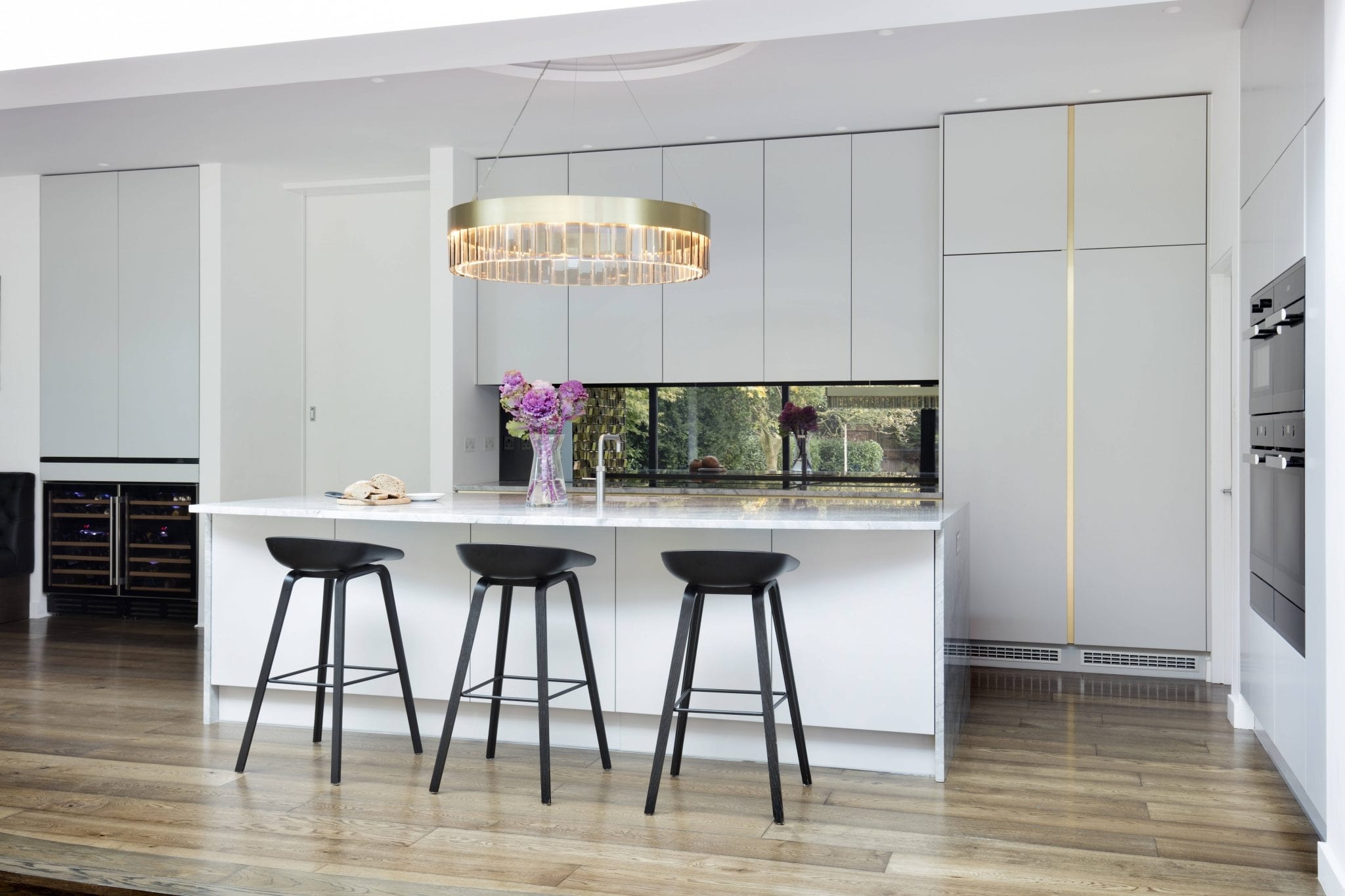
Opting for bold tones, textural surfaces and contrasting colours that are tactile in appearance creates an engaging feel.
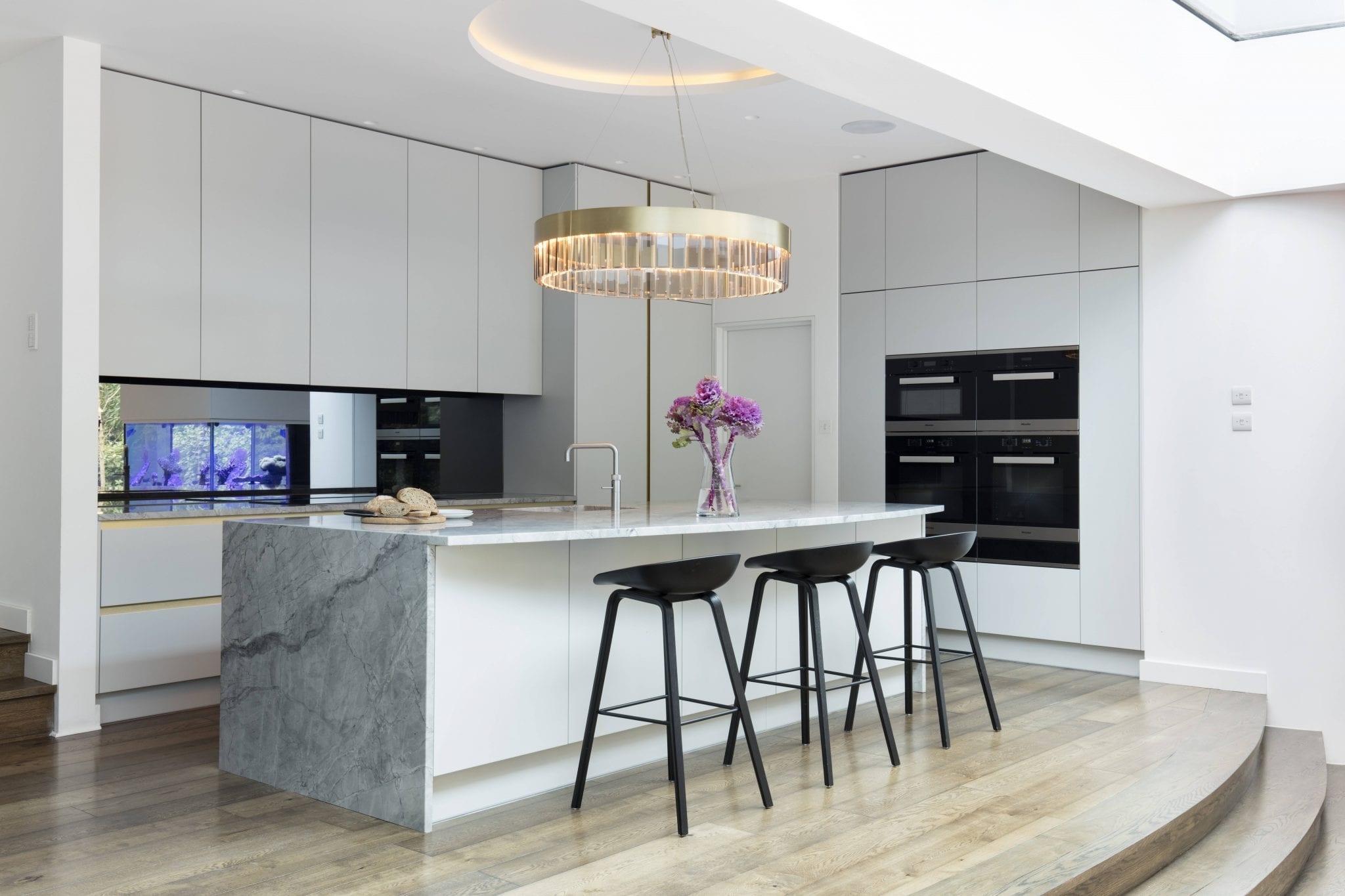
Opting for bold tones, textural surfaces, and contrasting colours creates an engaging, tactile experience. Each surface invites touch – making the space feel dynamic and full of life.
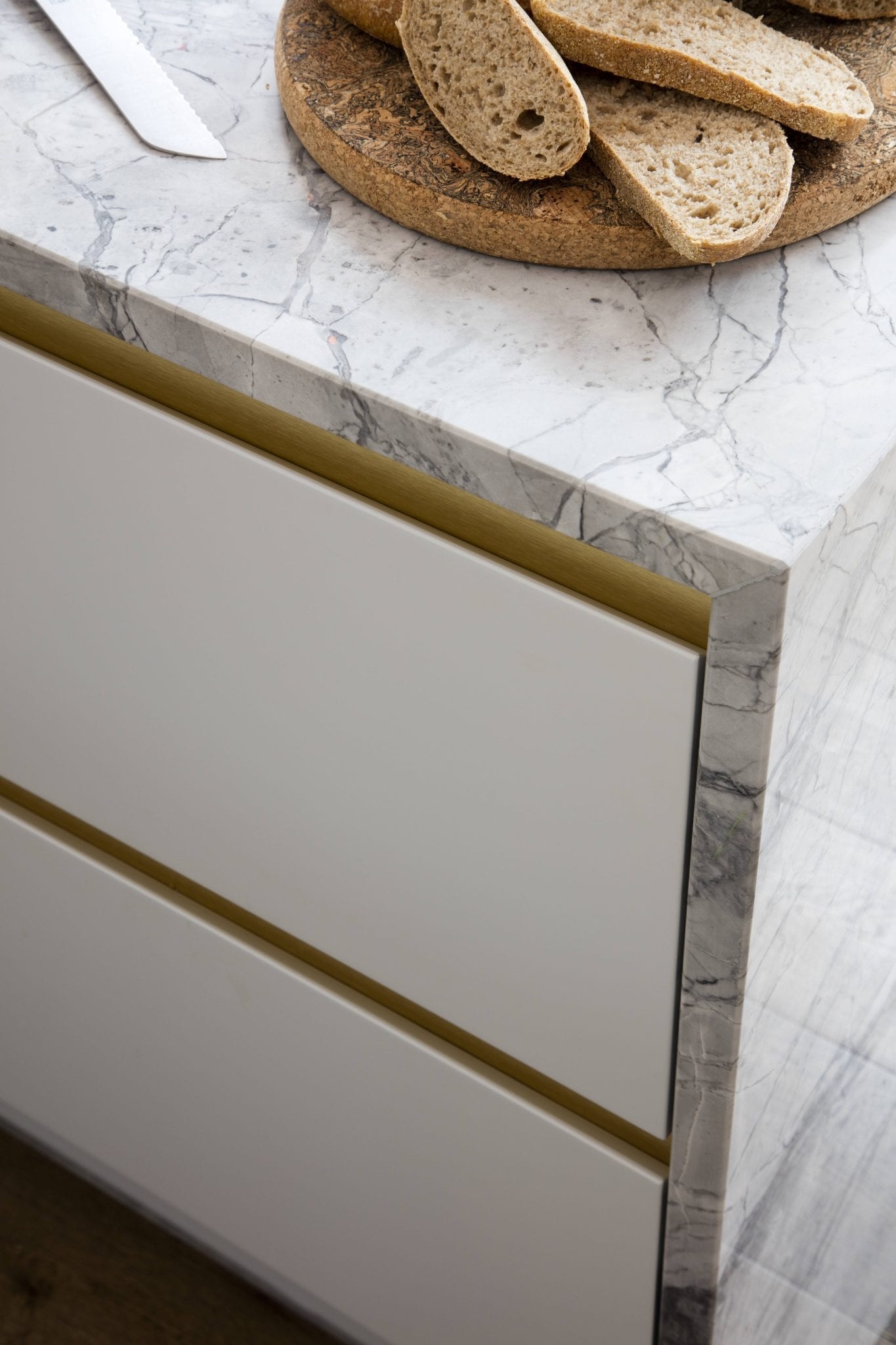
A brass recessed channel elegantly highlights the drawers and Moonrock granite. It’s a sophisticated touch; one that our clients took much delight in.
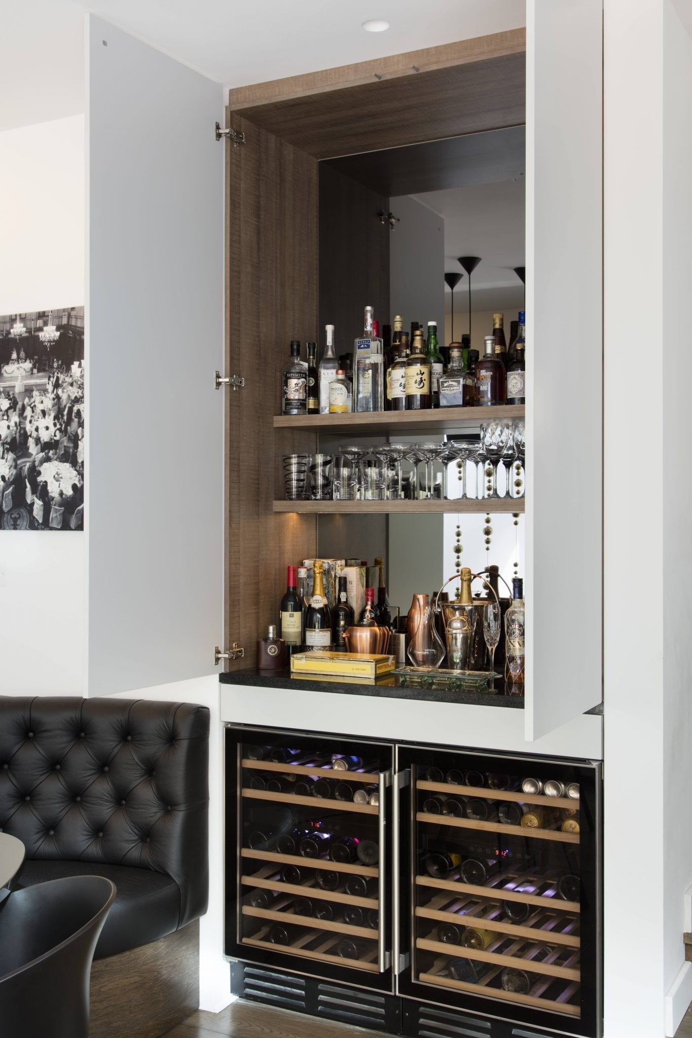
The bar unit, complete with wine fridges, offers additional storage in the dining area. The internal mirror and lighting add another elegant detail to this space.