

You stand in your living room and glance towards the hallway. The furniture feels right, the lighting works… but something doesn’t sit comfortably. It’s the colours. They don’t speak to each other. When decorating room by room, it’s easy to lose that sense of flow – spaces can feel disconnected, as if the story pauses at every doorway.
Choosing a colour scheme for your home is one of the most powerful ways to influence how your space feels. At Amberth, our bespoke kitchen and bathroom designs in London always consider the entire home, ensuring colours, materials, and textures transition effortlessly from one room to the next.
Entranceways are the Missing Link
Your entranceways hold the key to cohesion. Each doorway acts as a frame, an opportunity to create a visual narrative that guides the eye into the next room. This is where your design intention makes all the difference. Framing entranceways with colour, texture, or carefully placed decor ensures your interiors feel connected rather than compartmentalised.
Creating Contrast in Your Colour Scheme
Picture yourself walking through a rustic pantry into a light-filled bespoke kitchen in North London. A darker doorway frames the pale cabinetry beyond, making the kitchen glow more brightly. Small details – a trailing plant, a piece of art in sightline – invite you forward. Contrast adds rhythm and intrigue to your journey through your home.
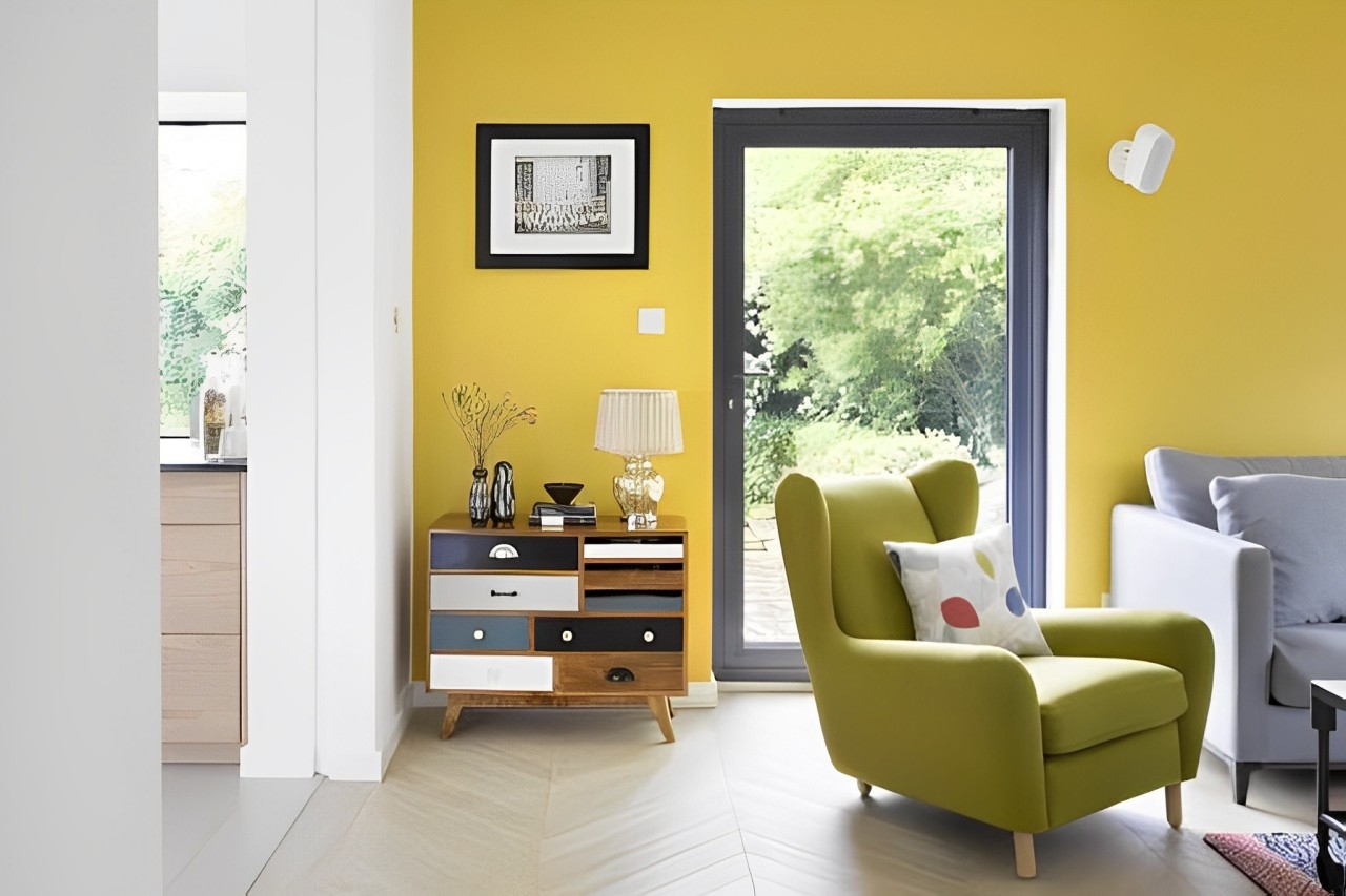
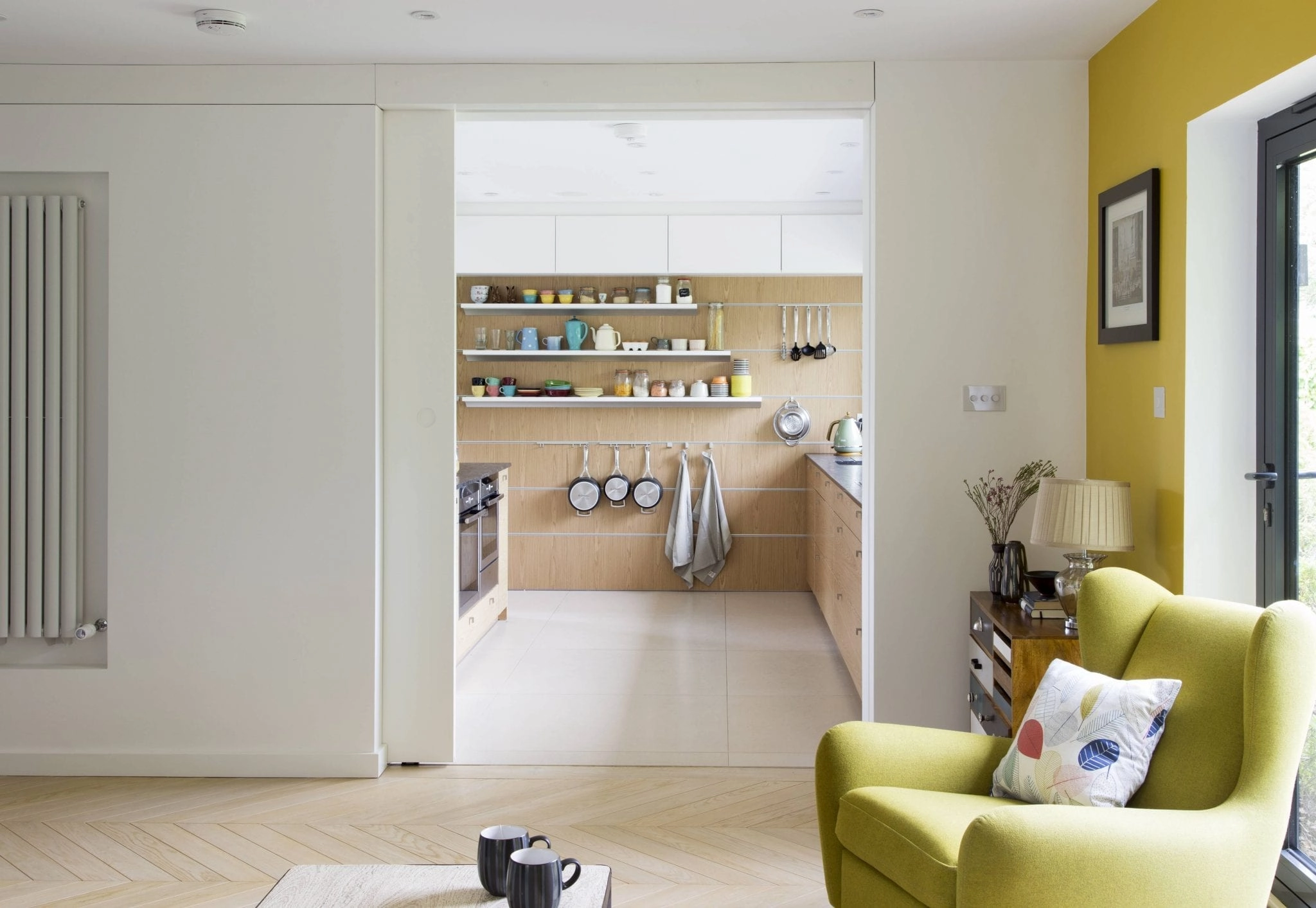 Wyndham Road Project by Amberth
Making a Statement with Bold Colours
For those who want impact, bold colours can make a doorway the focal point. A saturated shade around an architrave or a vibrant feature wall turns a passage into an artwork in itself. Balance is essential, however, as a strong colour requires thoughtfully placed decor, such as a single statement artwork or sculptural light fitting, to complete rather than compete.
Subtle Transitions Create Flow
Not every transition needs to be dramatic, however. Sometimes you prefer calm over drama. Subtle tonal shifts create a soft flow that feels natural. When adjoining rooms share a neutral palette, texture and placement become the guiding notes. At our Wyndham Road project, we used natural light and carefully considered furnishings to ensure each entrance view felt harmonious, creating a tranquil rhythm from room to room.
 Hereford Road Project by Amberth
Bringing It All Together for Cohesive Design
Your home is a series of interconnected spaces, each with its own purpose yet part of a greater whole. Your home should feel uniquely you with cohesion in mind, aligning colours, finishes, and lighting to create continuity that feels coherent, yet deeply personal.
Next time you stand in a doorway, pause and take in the view. Each threshold is a moment of design. When colour, texture, and detail align, your home feels whole and connected with intention. Your intention.
Ready to create a home with seamless flow?
You’re welcome at our high-end interiors studio in Islington, North London. Book a consultation with our team and let us help you craft a colour scheme that feels uniquely yours.
.
.
.
.
FAQs: Choosing a Home Colour Scheme
How do I make colours flow from one room to another?
Choose a consistent undertone or complementary palette, and repeat subtle accents such as hardware finishes, flooring, or textiles across spaces.
Can bold colours still feel cohesive?
Yes. Bold tones work when balanced with neutrals and repeated in smaller elements throughout the home, ensuring continuity without uniformity.
What if my rooms get different levels of natural light?
Adjust the palette to suit each room’s light quality while maintaining cohesion. Lighter pastels can brighten shaded rooms, while deeper hues feel good in sunlit spaces.
Should I use the same flooring throughout?
A consistent floor finish creates instant flow, but transitions can also be achieved by matching tones and textures even when materials differ.


