Pantone’s Colour of the Year for 2025, Mocha Mousse, brings a sophisticated, earthy warmth to the forefront. This rich, mocha-inspired shade is versatile, timeless, and perfect for creating a welcoming atmosphere in any space. But as we all know, a great colour is only part of the equation when it comes to interior design. If you use colours that compliment Mocha Mousse, you’ve got a design masterpiece.
In this blog, we’ll explore the complementary colour palettes that pair beautifully with Mocha Mousse, and how you can use them to enhance your home’s design.
1. Soft Neutrals – Warmth Meets Calm
Pair Mocha Mousse with soft neutrals like beige, ivory, and taupe for a balanced, serene look,. These colours won’t compete with the richness of the mocha hue, but instead, they will complement its depth and warmth. The result is a sophisticated, understated palette that exudes calmness. Think soft cream-coloured walls, with Mocha Mousse accents in furniture or décor.
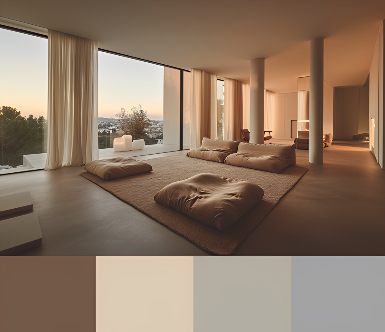 Pantone – Colour Pallette Generated in Canva
2. Earthy Greens – A Natural Harmony
Earthy greens, such as sage or olive, are fantastic partners for our Pantone Colour of the Year because they bring a sense of nature into your space. The deep brown tones of Mocha Mousse work harmoniously with the muted green shades, creating a grounded and organic feel. You can incorporate green elements through plants, soft furnishings, or even a feature wall to bring nature indoors in a stylish, fresh way.
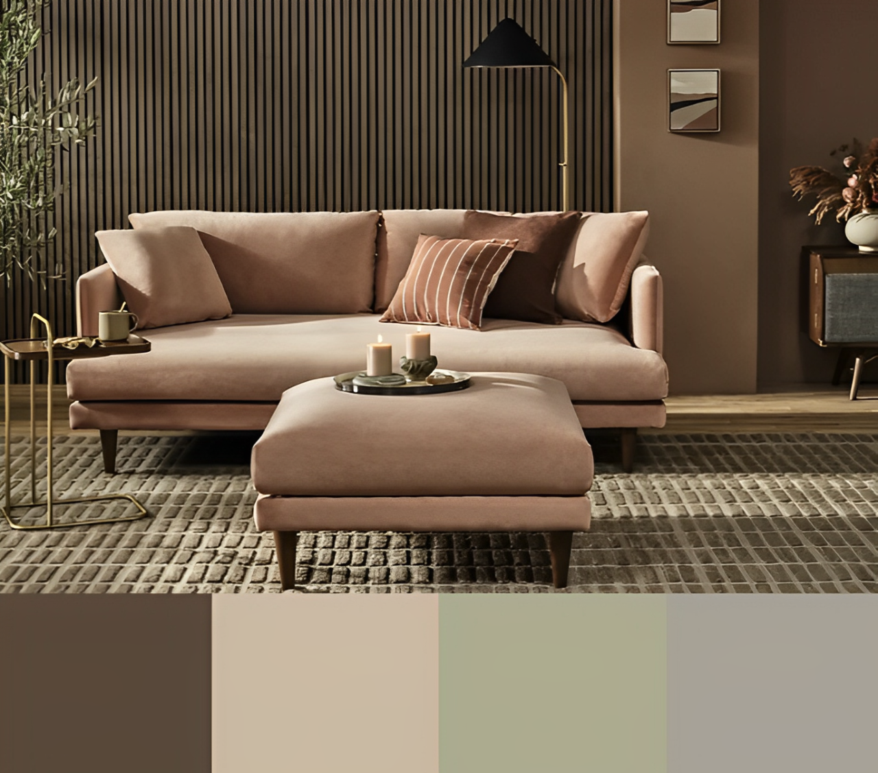 BBC Article – Colour Pallette Generated in Canva
3. Rich Golds – Add a Touch of Luxury
For those who want to make a bolder statement, rich gold and metallic accents are perfect complements to Mocha Mousse. The warmth of the gold tones will add a luxurious touch to any space, while still complementing the deep, earthy undertones of the mocha colour. Gold fixtures, hardware, or statement pieces can bring a touch of opulence and elevate the overall feel of the room.
 Color Meanings – Colour Pallette Generated in Canva
4. Soft Blush Pinks – Subtle Contrast
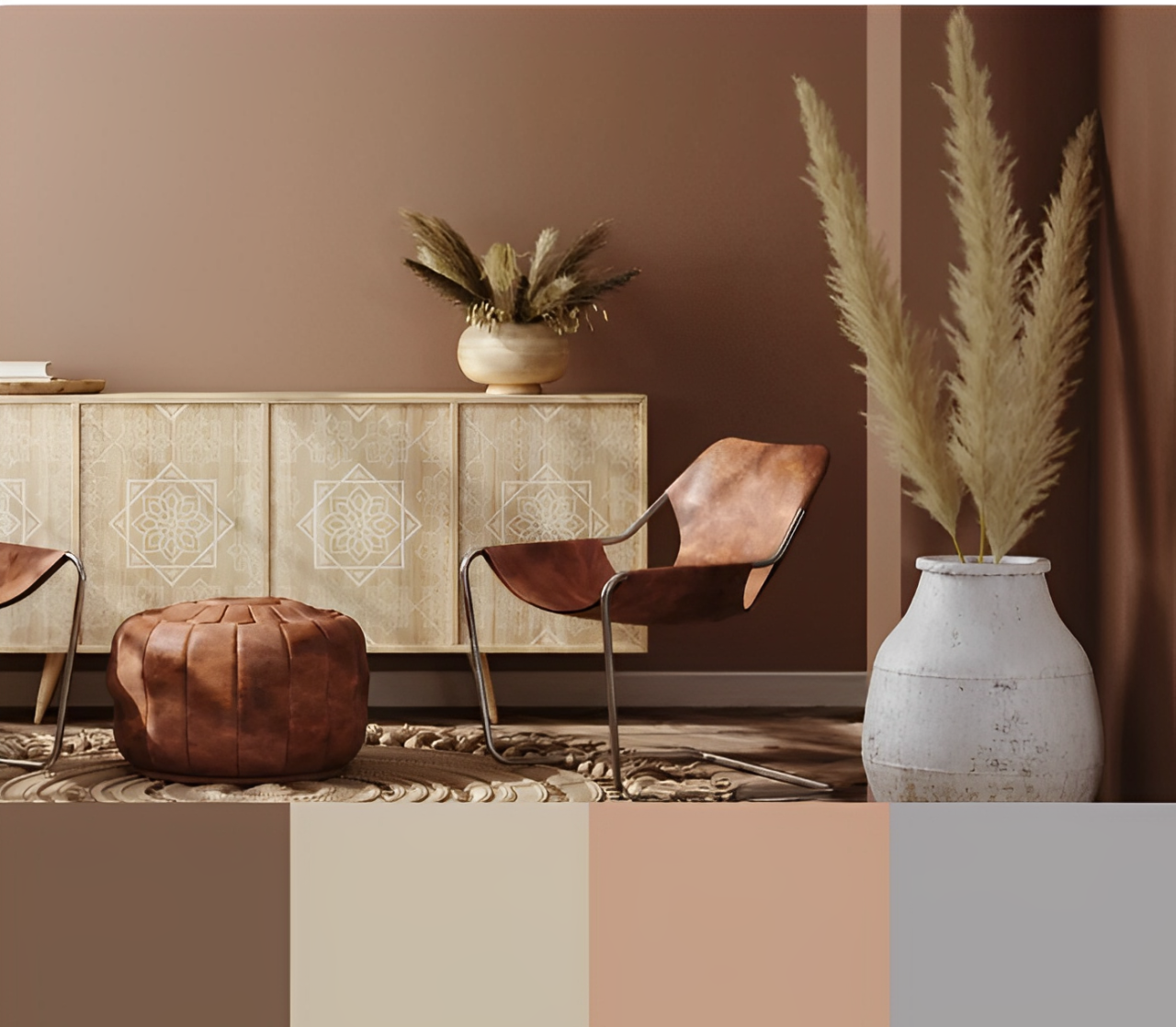
If you’re looking for a slightly more feminine and modern contrast, soft blush pinks and Mocha Mousse are a gentle yet dynamic pairing. This combination can be used for bedrooms, living rooms, or even bathrooms, offering warmth and freshness without overwhelming the space.
![]() Pixels – Colour Pallette Generated in Canva
Pixels – Colour Pallette Generated in Canva
5. Deep Blues – Bold and Dramatic
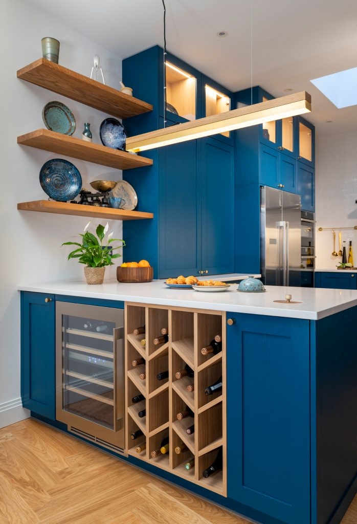
For a more dramatic effect, deep navy or indigo blues can create a striking contrast with Mocha Mousse. These darker, cooler tones offer balance to the warm brown, and when used strategically, they can bring a sense of sophistication and timelessness to the space. Consider using navy blue for accent walls, cushions, or even through textiles like curtains and rugs for a beautiful, bold pairing.
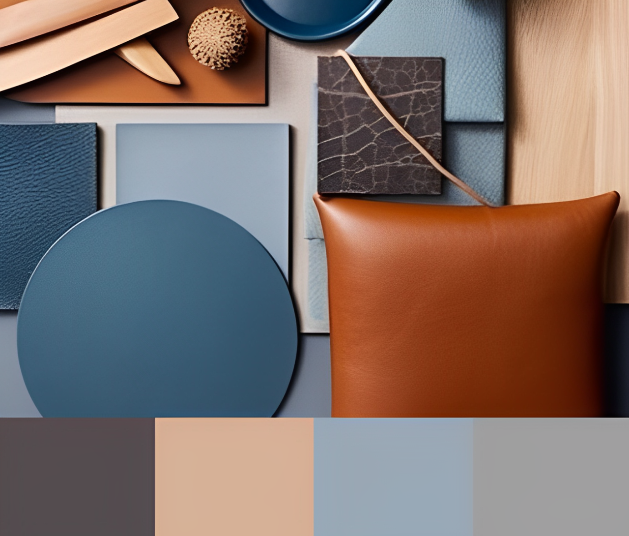 Pinterest – Colour Pallette Generated in Canva
6. Vibrant Terracotta – Earthy Richness
For those who love a more earthy, rustic vibe, terracotta orange is an unexpected but complementary partner for Mocha Mousse. The warmth of both colours plays off each other perfectly, creating a dynamic and lively atmosphere. Incorporating terracotta tones through ceramics, pottery, or throw pillows can add texture and vibrancy to the space.
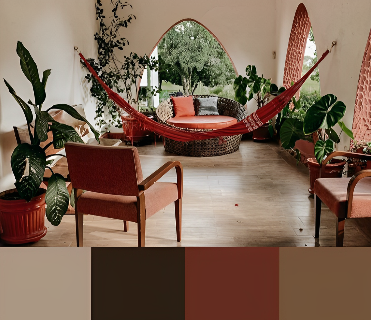 Pinterest – Colour Pallette Generated in Canva
How to Incorporate These Complementary Palettes into Your Home
When creating a design scheme with complementary colour palettes, balance is key. Choose one colour to dominate (in this case, Mocha Mousse) and use complementary colours to create accents and highlights. Here are some tips on how to integrate these colours into your home:
- Accent Walls: Use one of the complementary colours for a feature wall. This creates a focal point and can enhance the richness of Mocha Mousse without overpowering it.
- Textiles: Soft furnishings like cushions, throws, and curtains are an easy way to incorporate complementary colours. They’re also easy to update when you want to refresh your space.
- Artwork and Decor: Statement artwork or decor pieces in complementary colours will add depth and interest to the room.
- Furniture: Consider introducing complementary hues into larger furniture pieces, like chairs or sofas, to help anchor the design scheme.
Final Thoughts
With its deep, earthy tones, Mocha Mousse is a timeless and versatile colour that pairs beautifully with a range of complementary colours. Whether you’re drawn to calming neutrals, earthy greens, or bold contrasts with navy blue or terracotta, this Pantone colour of the year offers endless possibilities for creating a stunning, personalised space.
